Design and Color Trends in 2014When it comes to color trends in interior design there is one ‘guru’ that all others look to – Pantone. You can expect to see their color predictions popping up everywhere this spring, summer and fall.
Here at Vita Futura we have taken their guidance and our European design team has developed the color direction of our bathroom decor collection for 2014.
So, if you are keen to embrace the latest color trends set to hit stores this year then make sure you read on:
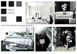
Black and White. This is a color scheme that’s a real classic and it’s going to be particularly ‘hot’ this year. And no wonder - it’s understated, yet at the same time pretty dramatic. But don’t be fooled into thinking it’s just about black and white – silver and grey touches are a great way of adding some individuality. Don’t think you have to stick to regular rectangles either – look at these great graphic and geometric patterns.
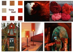
Cozy Red. A fiery color, red can be many things – and one of them is cozy. Red in burgundy and with slight rusty tones add a warm and welcoming feel to a room while mandarin is glamourous and elegant (especially when it’s in glossy or a lacquer finish). Use it in dramatic ways with stripes and vivid contrasts (think red/white or red/black). Introduce coral to tone things down a little if it’s all a bit much.
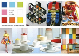
Fresh and Funky. We love funky and the current trend for birds of paradise, butterflies and big graphic flowers will unleash your creative side. And it’s such fun too! The bolder and more contrasting the shades the better in our book. This is a wonderful ‘in your face’ look that’s going to be around for a very long time to come; certainly well into 2015 we predict. And aren’t you glad?
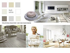
Soft White. If it's a calm, zen like feeling you desire - soft whites provide us with some thinking space but it’s a warm shade too and especially when mixed with pastel pinks, violets and light browns. A nice summer palette and very feminine.
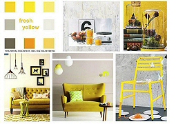
Fresh Yellow. How do you go about adding some cheer into your home? Easy - just add the sunshine : yellow. Just think how cheered up you feel when you pop a bunch of daffodils into a vase and sit them on your windowsill for instance! Whether its buttercup yellow, mellow yellow, mustard yellow or even neon yellow, it’ll always give you that lift we all seek first thing in the morning (and that’s before you grab your first cup of coffee).
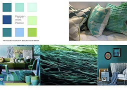
Peppermint. Who doesn’t love this gorgeous cooling and refreshing shade? Mix fresh aqua tones with white and feel your head clear instantly. That aqua can incorporate the turquoise of the sea, the light green of mint or the bright green of meadow grass on a summer’s day. And then there’s teal which has remained a color contender for the past three years.
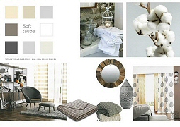
Soft Taupe. Oh how we love the elegance of taupe. Another classic and timeless color scheme which provides us with a sense of calm and order. Rich cream, beige and the browns of light wood mixed with pure white, this is a perfect color scheme when you want to relax and think graceful thoughts. It also works well with a shabby chic and country look if that’s your style.
Watch out for some fab bathroom rugs in this shade coming up at Vita Futura. There are certainly plenty of choices out there. Now you just have to decide which you prefer. We’ll be waiting…
|

